Date Picker
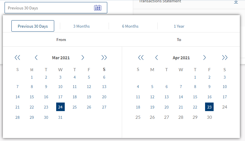
The Date Picker component is a contractual component that helps you to view a customized calendar.
Namespace
com.temenos.infinityComponent.datePicker
Contract Definition
Contracts are used to customize behavior, user experience, and manipulate the data or object of a component. Contracts are made available by exposing properties, methods, and events.
- Properties: Used to define the behavior of the component.
- Methods: Form or other components can use these methods to interact with the component.
- Events: Events are generated on the component. Implementation teams can define business logic to configure the execution of events.
Assumption: The parent form or component that is using the date picker component should have a label widget with id and name attribute with the value, lblAutoDays. It captures and displays the date range selected in the date picker component.
Properties
|
Properties |
Programmatic Name |
Quantum Type |
Temenos Digital Type
|
Description |
Default value |
Remarks |
|---|---|---|---|---|---|---|
|
General |
|
|
|
|
|
|
|
Default Date Selection Labels |
defaultDateSelectionLabels |
String |
String |
Contains labels of default dates that are to be used across tabs. |
Previous 7 Days,Previous 30 Days, 3 Months,6 Months,Last Year,YTD,Since Inception |
The default configured values are the values that are supported as of today. |
|
Default Date Selection Keys |
defaultDateSelectionKeys |
String |
String |
Contains keys of default dates that are to be used across tabs. |
7D,30D,90D,180D,365D,YTD, sinceInception |
The default configured values are the values that are supported as of today. |
|
parent component Widget Name |
parentComponentName |
String |
String |
Name of the parent component |
portfolioDetails |
|
|
Skins |
|
|
|
|
|
|
|
Selected Date Skin |
selectedDateSkin |
String |
String |
Used for the date that you selected. |
sknLblSSPFFFFFF15PxBg003E75 |
|
|
Unselected Date Skin |
unselectedDateSkin |
String |
String |
Used for the dates that you have not yet selected. |
bbSknLblSSP4176A415Px |
|
|
Disabled Date Skin |
disabledDateSkin |
String |
String |
Used for the dates that are not available for you to select. |
bbSknLbl727272Lato15Px |
|
|
Primary Button Skin |
primaryButtonSkin |
String |
String |
Used for primary buttons such as Confirm and Continue. |
sknBtnNormalSSPFFFFFF15Px |
|
|
Secondary Button Skin |
secondaryButtonSkin |
String |
String |
Used for secondary buttons such as Cancel. |
sknBtnSSP0273e3Border0273e3 |
|
|
Current Date Skin |
currentDateSkin |
String |
String |
Used for current date skin. |
sknLbl003e75SSP15px |
|
|
Week End Date Skin |
weekEndSkin |
String |
String |
Used for weekend dates. |
bbSknLbl727272Lato15Px |
|
|
From To Skin |
fromToSkin |
String |
String |
Used for the From label . |
sknLblSSPSB42424215Px |
|
|
Date Flex Skin |
dateFlexSkin |
String |
String |
Used for the Tolabel. |
|
|
|
Start Date Range Skin |
startDateRangeSkin |
String |
String |
Used for a set of start dates that are available to select. |
sknLbl4176A4SSP15Px |
|
|
Unselected Range Skin |
unSelectedRangeSkin |
String |
String |
Used for a set of start dates that are available to select. |
sknLbl4176A4SSP15Px |
|
|
Disabled Date Skin |
disabledRangeSkin |
String |
String |
Used for a set of start dates that are not available to select. |
bbSknLbl727272Lato15Px |
|
|
Labels |
|
|
|
|
|
|
|
Primary Button Label |
primaryButtonLabel |
String |
String |
Used for primary buttons such as Apply and Continue. |
Apply |
|
|
Secondary Button Label |
secondaryButtonLabel |
String |
String |
Used for secondary buttons such as Clear and Cancel. |
Clear |
|
|
From Label |
fromLabel |
String |
String |
Used for the From label. |
From |
|
|
To Label |
toLabel |
String |
String |
Used for the To label |
To |
|
|
Format |
|
|
|
|
|
|
|
Custom Date Format |
customDateFormat |
String |
String |
|
None |
|
|
Default Date Format |
defaultDateFormat |
String |
String |
|
None |
|
|
Images |
|
|
|
|
|
|
|
Previous Month Image |
previousMonthImage |
String |
String |
Image that is used for the previous month |
None |
|
|
Next Month Image |
nextMonthImage |
String |
String |
Image that is used for the next month |
None |
|
|
Next Year Image |
nextYearImage |
String |
String |
Image that is used for the next year |
None |
|
|
Previous Year Image |
previousYearImage |
String |
String |
Image that is used for the previous year. |
None |
|
Methods
|
Methods |
Description |
|---|---|
|
setDefaultDateFilter |
This method sets the filter label and their corresponding date labels based on the provided input parameter. The value that is provided as an input to the setDefaultDateFilter method should be one of the possible values mentioned for the defaultDateSelectionKeys property. For example, if 30D is provided as a value to setDefaultDateFilter, it will be set the default value of the filter label selection to Previous 30 Days and set the corresponding date labels in both the From and To calendars, accordingly. |
|
setSelectedDate |
In the case of custom date selection, this method saves the selected date in the From calendar to a global variable. |
|
setSelectedDateTo |
In the case of custom date selection, this method saves the selected date in the To calendar to a global variable. |
|
setMonthLabelText |
This method sets the display label such as Jan, Feb, and March for the months in the From calendar. |
|
setMonthLabelTextTo |
This method sets the display label such as Jan, Feb, and March for the months in the To calendar. |
|
setMonthData |
This method sets the data such as days and date for the previous, current, and the upcoming months accordingly based on the year selected in the From calendar. |
|
setMonthDataTo |
This method sets the data such as days and date for the previous, current, and the upcoming months accordingly based on the year selected in the To calendar. |
|
reRenderCurrentMonthSkins |
This method sets the skins for the custom date label selected in the ‘From calendar. |
|
reRenderCurrentMonthSkinsTo |
This method sets the skins for the custom date label selected in the ‘From calendar. |
|
setUpDateFilter |
This method accepts the following parameters and sets up the calendar view for display accordingly.
The values for the mentioned parameters can be any one of the supported values for the defaultDateSelectionLabels and defaultDateSelectionKeys properties. |
|
resetCalendar |
This method resets the calendar view to its original state. |
Events
| Methods |
Description |
|---|---|
|
updateDates |
This is a custom event that is exposed to the parent form or component in order to retrieve the selected from and to date values from the date picker component for further processing. |
In this topic