Custom Footer
Custom Footer is one of the most-used components. The footer has the following links:
- Locate Us
- Contact Us
- Terms and Conditions
- Privacy Policy
- FAQs
.png)
This component also has responsive properties for the widgets within the component. You need not explicitly assign the breakpoint values in every form for the footer component.
Usage
Here are the steps to set the component in Quantum Visualizer:
- Open the Temenos DigitalOrigination project in Quantum Visualizer.
- Drag and drop a Flex Container widget onto the required form.
- Select the Flex Container and set the following properties:
- width: "100%"
- left: "0%"
- top: "0%"
- height: "150 Dp"
- Insert the component in the flex and write the following code in the respective form Controller's onBreakPointChange function.
this.view.customFooter.onBreakpointChange(<current breakpoint>);
- Set the following APIs in the Component Controller and provide the navigation code snippets in the pages:
- showLocateUsPage: To show Locate us page.
- showFAQs: To show FAQ page.
- showTermsAndConditions: To show Terms and Conditions page.
- showContactUsPage: To show Contact us page.
- showPrivacyPolicyPage: To show Privacy Policy page.
APIs
 setPosition
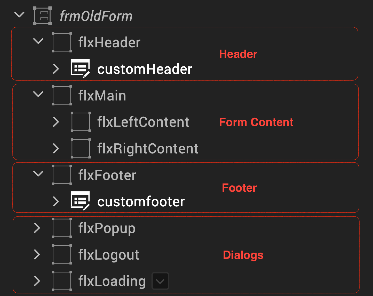
Call this API if the form is following older layout.
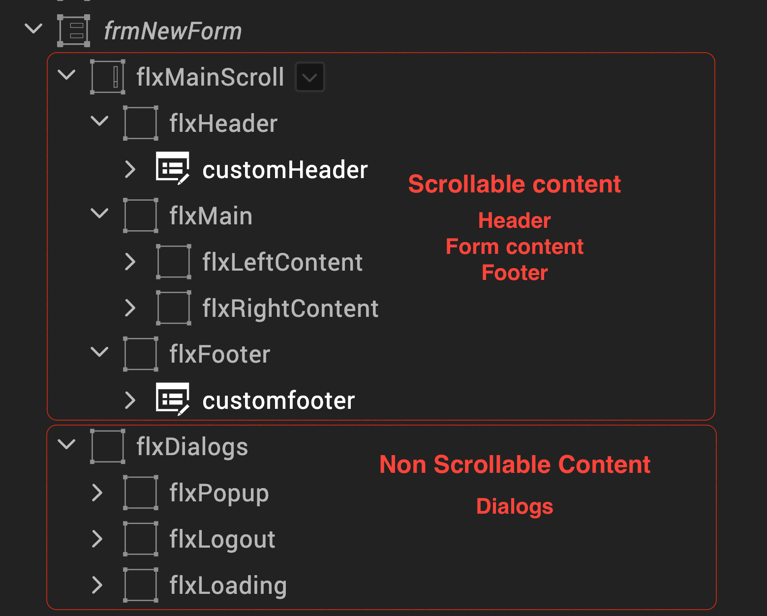
In the older layout, the form contains a free form layout and the form handles the scroll behaviour in the browser.
But in the new layout, two new containers are added. flxMainScroll is a scroll container, flxDialogs is a flex container. Furthermore, the flxMainScroll container handles the scroll behaviour in this layout.
this.view.customFooter.setPosition.call(this);
In this topic