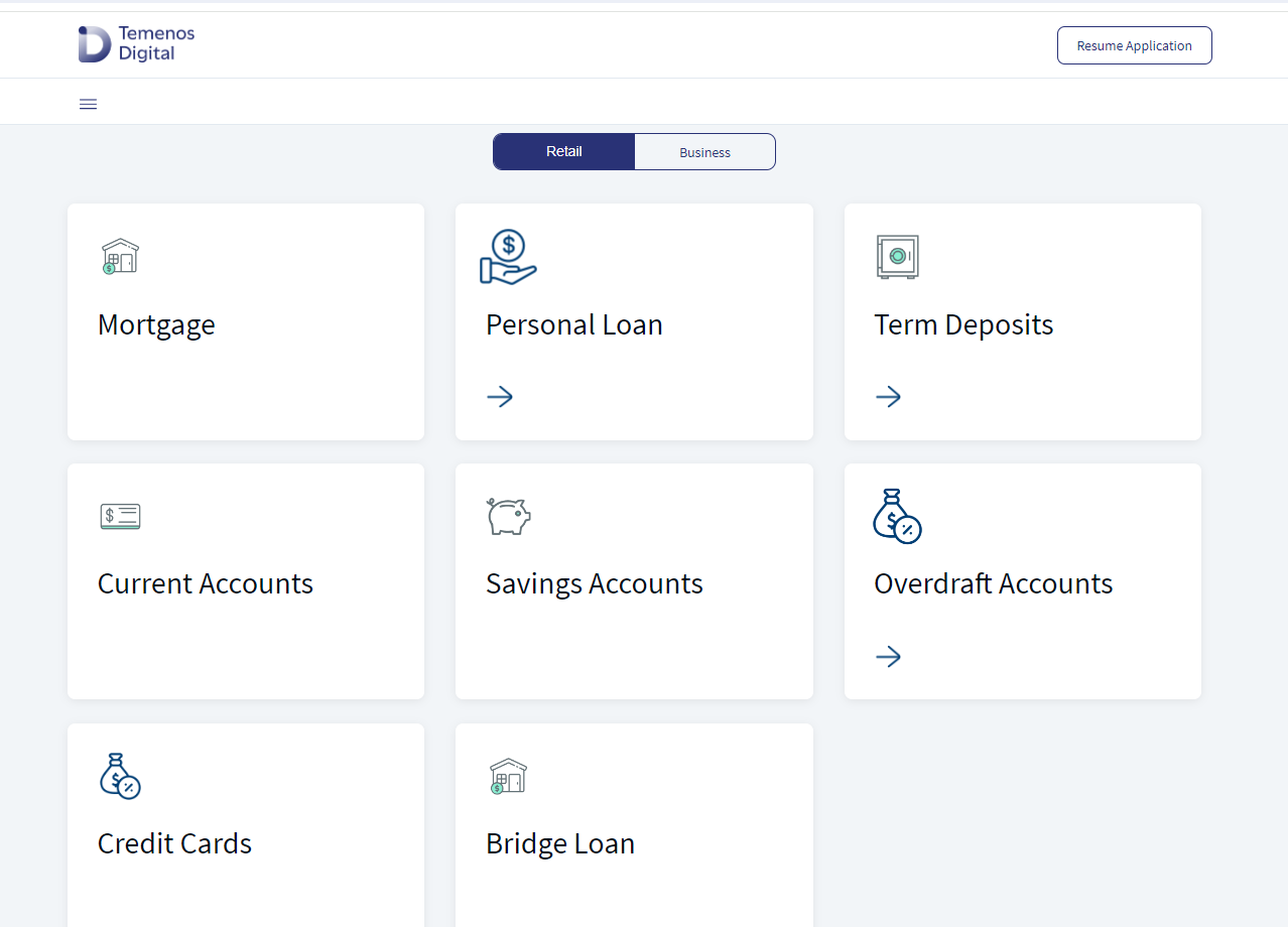
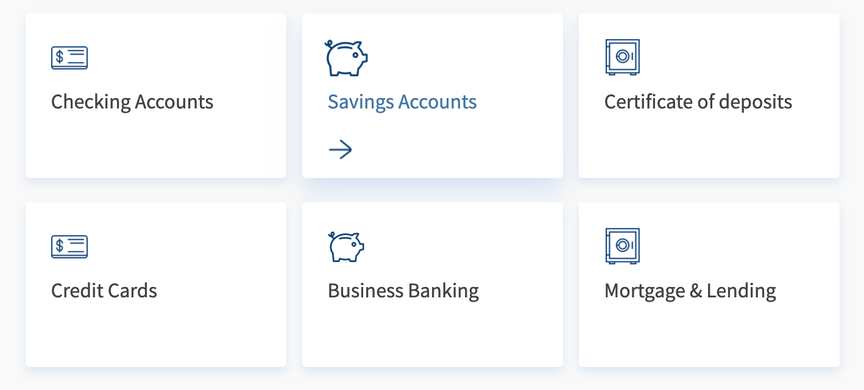
Landing Cards
This component is used to display different products in Temenos Digital Origination app landing screen.
Following are the various views of the Landing Cards component:
- Desktop view: width > 1366
- Tablet view: 640 < width <= 1024
- Mobile view: width <= 640
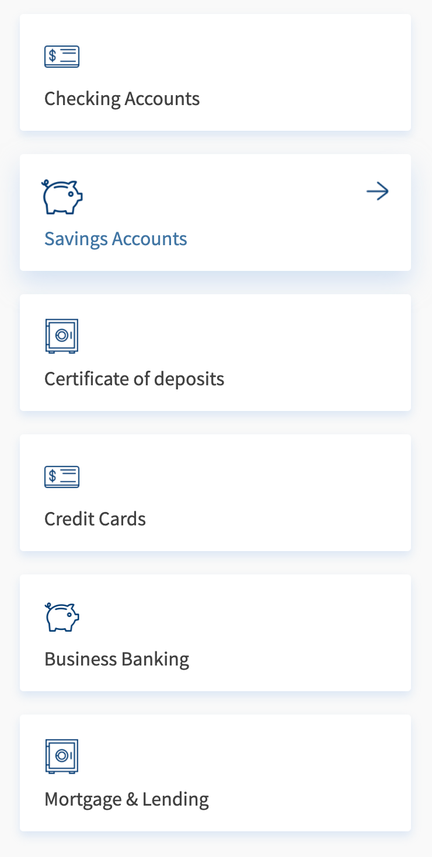
The component has an On-hover animation applied. On hovering over a product, the following changes appear:
- Label font turns blue
- Drop shadow increases
- Arrow animates from left
- Icon scales to 120% of its original size.
Maximum no of cards in one component instance is three. The example shown contains 6 cards and is achieved using 2 instances of the component.
Usage
Here are the steps to set the component in Quantum Visualizer:
- Open the Temenos DigitalOrigination project in Quantum Visualizer.
- Drag and drop a Flex Container widget onto the required form.
- Select the Flex Container and set the following properties:
- Layout type: "flow vertical"
- Height: "Preferred"
- Insert the component in the Flex Container.
You can add multiple instances of the component to the same Flex to add multiple products. The images have 2 instances of the component to show 6 products.
APIs
 setData
Sets data to the component.
Parameters:
data (Array of Objects) - mandatory
It has a maximum limit of 3 objects. If an object is not sent then that product is not displayed.
Example:
var data = [{
    text: "Checking Accounts",   // product title
    image: "checkinaccount.png", // icon of the product
    onClickCallback: callbackFun // callback function
}, {
    text: "Savings Accounts",
    image: "savingsaccounts.png",
    onClickCallback: callbackFun
}, {
    text: "Certificate of deposits",
    image: "cd.png",
    onClickCallback: callbackFun
}];
var callbackFun : function (cardflx){
  kony.print("clicked on : " + cardflx.id)
};
this.view.LandingCards.setData(data);
Callbacks
onClickCallback
This will be invoked whenever a user clicks on the card.
Parameters:
cardflx
The cardflx parameter is of the type object. It is the reference of the clicked card flex. This should be set to the component while calling setData method of the component.
Example:
var data = [{
    text: "Checking Accounts",   // product title
    image: "checkinaccount.png", // icon of the product
    onClickCallback: callbackFun // callback function
}, {
    text: "Savings Accounts",
    image: "savingsaccounts.png",
    onClickCallback: callbackFun
}, {
    text: "Certificate of deposits",
    image: "cd.png",
    onClickCallback: callbackFun
}];
var callbackFun : function (cardflx){
  kony.print("clicked on : " + cardflx.id)
};
this.view.LandingCards.setData(data);
In this topic