Temenos Digital
R24 AMR | Min(s) read
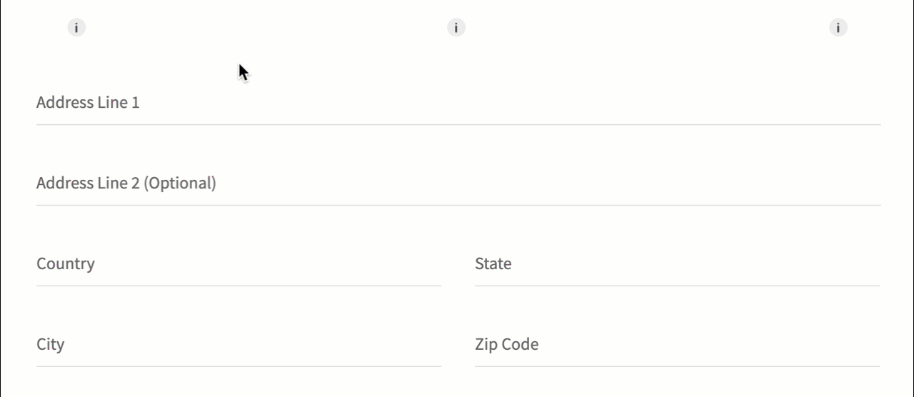
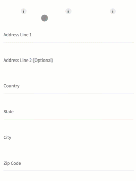
Information Tooltip
This component is used to display additional information to the users.
Following are the various views of the Information Tooltip component:
- Desktop & tablet view : width > 640
- Mobile view : width < 640
Assumptions:
- The width of the tooltip will be fixed to
- Desktop and Tablet - 300 Dp
- Mobile - 250 Dp
- The tooltip can have 3 possible positions (left/right/center) wrt the image. These positions can be set by calling a function of the component or while setting data to the component.
- There is no limit to number of characters or words that can be set to the info text
- The text is displayed in a Richtext widget. Therefore, you can display hyperlinks in them, if required.
Usage
Here are the steps to set the component in Quantum Visualizer:
- Open the Temenos DigitalOrigination project in Quantum Visualizer.
- Drag and drop a Flex Container widget onto the required form.
- Select the Flex Container and set the following properties:
- Clip bounds: "Off"
- Height: "30 Dp"
- Width: "30 Dp"
- Assign higher z index to the flex so that the tooltip appears on top of the content in the form
- Insert the component in the Flex Container.
APIs
 setData
Sets text and position of the tooltip.
Parameters:
- data (String) - mandatory
This is set to the text of Richtext widget of the component. This can also contain html tags that are supported by the Richtext widget. - pos (String) - optional
Has three possible positions that the infotext can have wrt info image. The options are not case sensitive- left
- center
- right
Example:
var data =  "Use this card to make point-of-sale purchaces and withdraw cash at ATM’s, as well as to make purchases at merchants worldwide. There is No <a href=\"https://konysolutions.atlassian.net/wiki/spaces/AUX/pages/2195554818/Information+Tooltip\" target=\"_blank\" rel=\"noopener noreferrer\">monthly fee</a>. Funds are automatically withdrawn from your checking account. (Please note : You must have good balance balance in your checking account in order to get a <a href=\"https://konysolutions.atlassian.net/wiki/spaces/AUX/pages/2195554818/Information+Tooltip\" target=\"_blank\" rel=\"noopener noreferrer\">VISA debit card</a>.)"
this.view.infoTooltip1.setData(data,"left");
Add target="_blank" rel="noopener noreferrer" attributes to the <a> tag so that the link opens in a new window. The data in the above example has these attributes added to it
In this topic