Feature Selection
This component is used to display features of the products that the users select. For example, additional features of products.
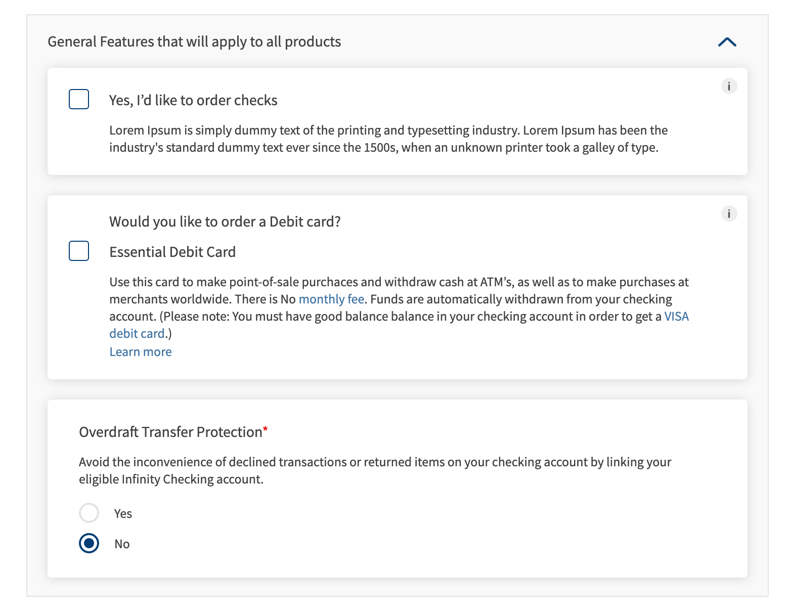
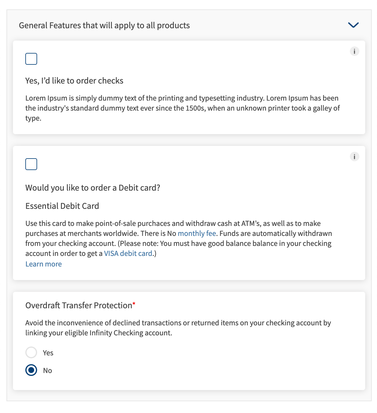
Following are the various views of the Feature Selection component:
- Desktop & tablet view : width > 640
- Mobile view : width < 640
The following are the assumptions/limitations of the component.
- There can be a max of 6 radio buttons.
- The radio buttons will be aligned vertically.
- The clickable area for the radio buttons is just the image.
Usage
Here are the steps to set the component in Quantum Visualizer:
- Open the Temenos DigitalOrigination project in Quantum Visualizer.
- Drag and drop a Flex Container widget onto the required form.
- Select the Flex Container and set the following properties:
- Layout type: "Flow Vertical"
- height: preferred
- Insert the component in the Flex Container.
- You can add multiple instances of the component using the following code
//n is the no of instances you want to add
//flxFeatures is the component's parent flex
for (let i = 0; i < n; i++) {
    var featureInstance = new com.dbx.featureSelection({
        "clipBounds": false,
        "id": "featureSelection" + i,
        "isVisible": true,
        "masterType": constants.MASTER_TYPE_DEFAULT,
        "top": "0dp",
        "zIndex": 1
    }, {}, {});
    featureInstance.setData(<data>,<otherData>);
    this.view.flxFeatures.add(featureInstance);
}
APIs
 setData
Sets the features data to the component.
Parameters:
- data (Array of Objects) - mandatory
This is set to the segment widget of the component. Callback for the “learn more” should be given in the data. - otherData (Object) - optional
This can be used to set properties of other widgets and/or set behaviour of the component
Example:
//sample callback
var learnMoreCallback = function(){
  //do stuff
}

//sample data
var sampleData = [{
        "imgCheckBox": "checkboxinactive.png",
        "rtxFeatureOptionDescription": "Lorem Ipsum is simply dummy text of the printing and typesetting industry. Lorem Ipsum has been the industry's standard dummy text ever since the 1500s, when an unknown printer took a galley of type.",
        "rtxFeatureOptionText": "Yes, I’d like to order checks",
        "rtxInfo": "Use this card to make point-of-sale purchaces and withdraw cash at ATM’s, as well as to make purchases at merchants worldwide.",
    },
    {
        "btnLearnMore": {
            "text": "Learn more",
            "onClick": learnMoreCallback
        },
        "imgCheckBox": "checkboxinactive.png",
        "rtxFeatureOptionDescription": "Use this card to make point-of-sale purchaces and withdraw cash at ATM’s, as well as to make purchases at merchants worldwide. There is No <a href=\"https://temenosglobal.invisionapp.com/d/main#/console/19871159/417119686/preview\" target=\"_blank\" rel=\"noopener noreferrer\">monthly fee</a>. Funds are automatically withdrawn from your checking account. (Please note : You must have good balance balance in your checking account in order to get a <a href=\"https://temenosglobal.invisionapp.com/d/main#/console/19871159/417119686/preview\" target=\"_blank\" rel=\"noopener noreferrer\">VISA debit card</a>.)",
        "rtxFeatureOptionText": "Essential Debit Card",
        "lblMainTitle": "Would you like to order a Debit card?",
        "rtxInfo": "Use this card to make point-of-sale purchaces and withdraw cash at ATM’s, as well as to make purchases at merchants worldwide.",
    },
    {
        "rtxFeatureOptionDescription": "Avoid the inconvenience of declined transactions or returned items on your checking account by linking your eligible Infinity Checking account. ",
        "rtxFeatureOptionText": "Overdraft Transfer Protection",
        "imgRadio1": "radioinactive.png",
        "imgRadio2": "radioactive.png",
        "rtxRadio1": "Yes",
        "rtxRadio2": "No",
        "isMandatory": true
    }
];
var sampleOtherData = {
	featureName: "General Features that will apply to all products",
	isOptionsExpanded: "true"
};
this.view.featureSelection.setData(sampleData,sampleOtherData);
Add target = "_blank", rel = "noopener noreferrer" attributes to the <a> tag of rtxInfo in data parameter, so that the link opens in a new window.
setError
Sets error message to a row or multiple rows in a component.
Parameters:
errorData (Array of Objects) - mandatory
It contains the rowIndex and the error message to be set
var errorData = [{
    rowIndex : 0,
    errorMessage : "This is a sample error message"
}]
this.view.featureSelection.setError(errorData);
hideAllErrors
Hides all the error messages set to the component
this.view.featureSelection.hideAllErrors();
getData
Returns the segment data
this.view.featureSelection.getData();
In this topic