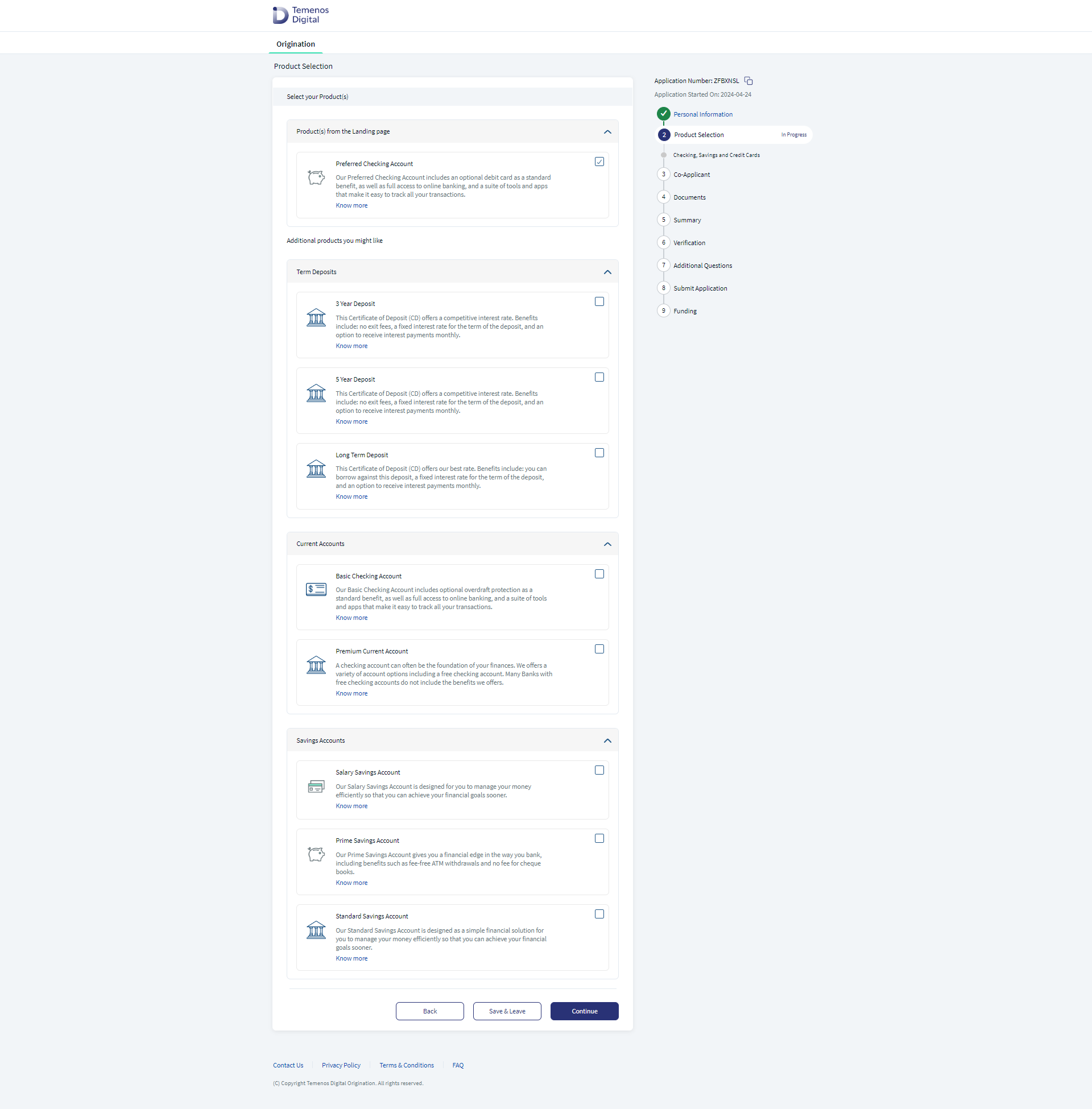
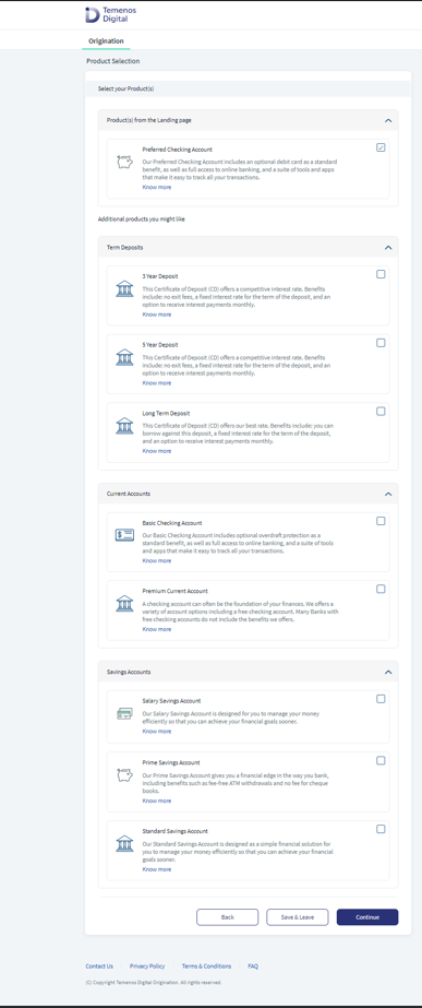
Select Products
This component contains a sub-header and a list of options with a dropdown indicator. On click of the dropdown indicator, the expanded view of the component appears where a list of options is displayed with a checkbox to multi-select the required option. This component is used in the Temenos DigitalOrigination app (previously known as Onboarding app) to display additional information to the user.
Following are the various views of the Select Products component:
- Desktop & tablet view: width > 640
- Mobile view: width < 640
Usage
Here are the steps to set the component in Quantum Visualizer:
- Open the Temenos DigitalOrigination project in Quantum Visualizer.
- Drag and drop a Flex Container widget onto the required form.
- Select the Flex Container and set the following properties:
- width: "100%"
- left and top as per required designs
- height: "preferred"
-
There can be one or more instances of the component. Use the following code for instantiating the component.
for(var NoOfInstances = 0; NoOfInstances<2; NoOfInstances++){ var NewCompInstance = new com.dbx.selectProducts({ "clipBounds": false, "id": "selectProducts" + NoOfInstances, "isVisible": true, "masterType": constants.MASTER_TYPE_DEFAULT, "zIndex": 1 }, {}, {}); this.view.FlexToAddComponents.add(NewCompInstance); } - Make sure that the parent Flex(FlexToAddComponents) is in flow vertical layout.
- Insert the component in the Flex and write the following code in the respective form’s onBreakPointChange function.
this.view.SelectProducts.onBreakpointChange(eventObj,width);
//width is the current breakpoint value
//eventObj is the component instance
APIs
 setSegData
Sets the products data.
Parameters:
- data (array of objects) - mandatory
Sets the products details. - isSelected (Boolean) - optional
Removes the dropdown from a particular section. - otherData (object) - optional
Example:
var data = [{
       imgCheckBox : {src : "checkbox_active.png"},
        flxCheckBox : {isVisible : true},
        lblProductDescription : "A free account for everyone! With no minimum balance or monthly service charge after opening your account.",
        lblProductTitle : "Totally Free Checking 2",
        btnKnowMore : {text : "Know More", onClick : this.navToDetails}, //Assign the onclick fun here to the button in data
        imgProduct : {src : "checkinaccount.png"},
      },{
        imgCheckBox : {src : "checkbox_active.png"},
        flxCheckBox : {isVisible : true},
        lblProductDescription : "A free account for everyone! With no minimum balance or monthly service charge after opening your account.",
        lblProductTitle : "Totally Free Checking2",
        btnKnowMore : {text : "Know More", onClick : this.navToDetails}, //Assign the onclick fun here to the button in data
        imgProduct : {src : "checkinaccount.png"},
      }
      ];
      var OtherData = {
      headerText : "Product title",
      headerTexti18n : i18nKey
      }
      this.view.selectProducts.setSegData(data,false,OtherData);
getSegData
Retrieves the segment data.
var productsData = this.view.SelectProducts.getSegData();
getSelectedProducts
Retrieves the selected options from the segment. It returns the array of the selected products.
var selectedOptions = this.view.SelectProducts.getSelectedProducts();
setSelectedProducts
This API is useful in the resume flow to set the options that have already been set.
Parameters:
selectedIndices - mandatory
Array of selected indices to be set to the products in a section.
this.view.SelectProducts.setSelectedProducts(selectedIndices);
showNoProducts
This API is useful when there are no products available in the particular section.
this.view.SelectProducts.showNoProducts();
Callbacks
setRowClickCallback
A callback is invoked whenever a user selects any row.
this.view.SelectProducts.setRowClickCallback(callback);
//callback is form controller function to be called on onRowClick
In this topic